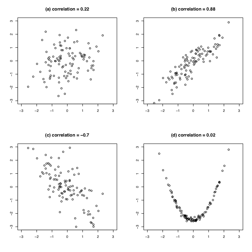
class: center, middle, inverse, title-slide # Week 07 - Regression ## Introduction to Linear Models <html> <div style="float:left"> </div> <hr color='#EB811B' size=1px width=800px> </html> ### Danilo Freire ### 6th March 2019 --- <style> .remark-slide-number { position: inherit; } .remark-slide-number .progress-bar-container { position: absolute; bottom: 0; height: 6px; display: block; left: 0; right: 0; } .remark-slide-number .progress-bar { height: 100%; background-color: #EB811B; } .orange { color: #EB811B; } </style> # Today's Agenda .font150[ * Review of correlation * From correlation to linear regression * Regression equations ] --- # Correlations and Scatter Plots ```r bivariate <- read.csv("https://raw.githubusercontent.com/pols1600/pols1600.github.io/master/datasets/prediction/bivariate_data.csv") bivariate <- subset(bivariate, Year == 2010) plot(log(bivariate$GDP), bivariate$Child.Mortality, pch = 19, main = "Log GDP Per Capita and Child Mortality") ``` <img src="week07b_files/figure-html/gap01-1.png" style="display: block; margin: auto;" /> ```r cor(bivariate$Child.Mortality, log(bivariate$GDP), use = "complete") ``` ``` ## [1] -0.7661286 ``` --- # Correlations .font150[ * .orange[Correlations:] the average product of the z-score of _x_ and the z-score of _y_ * `\(cor_{x,y} = \frac{1}{n-1} \sum^{n}_{i=1} \big(\frac{x_i - \bar{x}}{S_x} \times \frac{y_i - \bar{y}}{S_y}\big)\)` * Positive correlation: upward slope * Negative correlation: downward slope * High correlation: tighter, close to a line * Correlation .orange[cannot] capture nonlinear relationship ] --- # Correlations and Scatter Plots .center[] --- # From Correlation to Linear Regression .font150[ * Linear regression allows us to create predictions * Linear regression specifies direction of relationship * Linear regression allows us to examine more than two variables at the same time (statistical control) ] --- # Linear Regression .font150[ * Regression has .orange[one dependent (y)] and _for now_ .orange[one independent (x) variable] * Goal of regression is to approximate the (linear) relationship between X and Y as best as possible * Regression is the mathematical model to draw best fitting line through cloud of points * In R: `lm(Y ~ X, data = yourdataset)` ] --- # Linear Regression .font100[ ```r plot(log(bivariate$GDP), bivariate$Child.Mortality, pch = 19, main = "Log GDP Per Capita and Child Mortality", xlab = "Log GDP Per Capita", ylab = "Child Mortality") *abline(lm(Child.Mortality ~ log(GDP), data = bivariate), col = "red", lwd = 2) ``` <img src="week07b_files/figure-html/gap02-1.png" style="display: block; margin: auto;" /> ] .font120[For each x we have a prediction of y: .orange[what would we expect y to be given the value of x?] ] --- # What is the equation of a line? .font150[ * `\(y = mx + b\)` - `\(m\)` is the slope - `\(b\)` is the intercept * .orange[Regression equation]: `\(Y = \alpha + \beta X + \epsilon\)` - `\(\alpha\)` is the intercept - `\(\beta\)` is the slope - `\(\epsilon\)` is the error term ] --- # Interpretation .font150[ * `\(Y\)`: dependent/response/outcome variable * `\(\alpha\)`: value of `\(Y\)` when `\(X = 0\)` * `\(\beta\)`: increase/decrease in `\(Y\)` when `\(X\)` varies by one unit * `\(\alpha + \beta X\)`: average value of `\(Y\)` at a given value of `\(X\)` * `\(\epsilon\)`: difference between each point and the fitted line. Assumed to have a mean of zero * **BUT..** ] --- # Least Squares .font150[ * We don't know the true .orange[data generating process] (DGP) * So we have to _estimate_ the equation using collected data * Estimates are denoted with little hats: `\(\hat{\alpha}\)`, `\(\hat{\beta}\)` (read as "alpha hat", "beta hat") * We can use `\(\hat{\alpha}\)`, `\(\hat{\beta}\)` and `\(X\)` to create _predicted values of_ `\(Y\)` * `\(\hat{Y} = \hat{\alpha} + \hat{\beta}X\)`, predicted/fitted value * `\(\hat{\epsilon} = Y - \hat{Y} =\)` true `\(Y\)` - predicted `\(Y\)` * `\(\hat{\epsilon}\)` is a good measure of model fit ] --- # How Do We Estimate the Parameters? .font150[ * .orange[We minimise the _sum of the squared residuals (SSR)_] `$$\textsf{SSR} = \sum_{i=1}^n \hat\epsilon_i^2 = \sum_{i=1}^n (Y_i - \hat{Y_{i}})^2 = \sum_{i=1}^n (Y_i - \hat\alpha - \hat\beta X_i)^2$$` * This also minimises the root mean squared error: `\(RMSE = \sqrt{\frac{1}{n}\textsf{SSR}}\)` ] --- # Regression by Hand .font150[ * `\(\hat\alpha = \bar{Y} - \hat\beta \bar{X}\)` * `\(\hat\beta = \frac{\sum_{i=1}^n (Y_i - \overline{Y})(X_i - \overline{X})}{\sum_{i=1}^n (X_i - \overline{X})^2}\)` OR... ] --- # Regression by Hand .font150[ OR... * `\(\hat\beta = \textsf{correlation of X and Y} \times \frac{\textsf{standard deviation of Y}}{\textsf{standard deviation of X}}\)` * Regression line always goes through the point of averages `\(\hat{X},\hat{Y}\)` * `\(\hat{Y} = (\overline{Y} - \hat\beta \overline{X}) + \hat\beta \overline{X} = \overline{Y}\)` ] --- # Example .font120[ * Enough math! R makes it very easy to estimate linear models with `lm()` ```r lm(Child.Mortality ~ log(GDP), data = bivariate) ``` ``` ## ## Call: ## lm(formula = Child.Mortality ~ log(GDP), data = bivariate) ## ## Coefficients: ## (Intercept) log(GDP) ## 276.58 -26.13 ``` * `\(Y = 276.58 - 26.13X + \epsilon\)` * `\(Y\)` is child mortality in 100,000 births * .orange[How can we interpret the equation?] ] --- # GDP Per Capita and Life Expectancy .font120[ ```r library(gapminder) gapminder$gdppc1000 <- gapminder$gdpPercap/1000 # use $1,000s as unit lm(lifeExp ~ gdppc1000, data = gapminder) # life expectancy ~ GDPpc ``` ``` ## ## Call: ## lm(formula = lifeExp ~ gdppc1000, data = gapminder) ## ## Coefficients: ## (Intercept) gdppc1000 ## 53.9556 0.7649 ``` How would you interpret that result? ] --- class: inverse, center, middle # Questions? <html><div style='float:left'></div><hr color='#EB811B' size=1px width=720px></html> --- # Homework .font150[ * `swirl()` PREDICTION1 ] --- class: inverse, center, middle # See you on Friday! <html><div style='float:left'></div><hr color='#EB811B' size=1px width=720px></html>