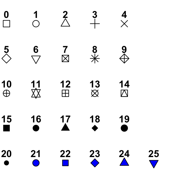
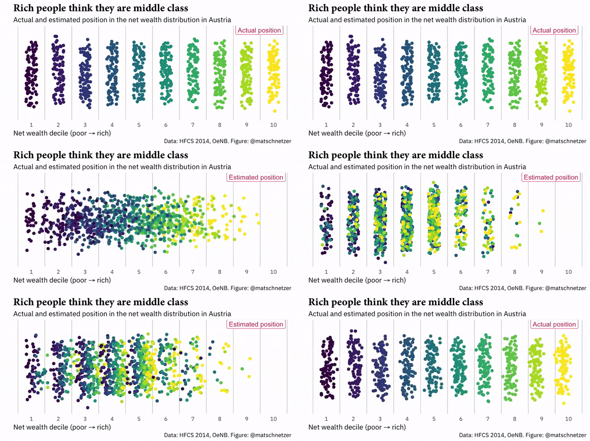
class: center, middle, inverse, title-slide # Week 05 - Measurement ## Bivariate Relationships: Scatter Plots and Correlations <html> <div style="float:left"> </div> <hr color='#EB811B' size=1px width=800px> </html> ### Danilo Freire ### 22th February 2019 --- <style> .remark-slide-number { position: inherit; } .remark-slide-number .progress-bar-container { position: absolute; bottom: 0; height: 6px; display: block; left: 0; right: 0; } .remark-slide-number .progress-bar { height: 100%; background-color: #EB811B; } .orange { color: #EB811B; } </style> # Today's Agenda .font150[ * Scatter plots * Correlations ] --- # Scatter Plots .font150[ * Scatter plots show how two variables are related to each other * Convention: _x_ is the independent variable (what you change), _y_ is the dependent variable (what you want to explain) * Cartesian coordinates (x, y) of the data points * `plot(x,y)` in R ] --- # Scatter Plots .font150[ * `plot()` also has many options: - `main`, `xlab`, `ylab`, `ylim`, `xlim`, `col` as we've seen before - `pch =` different plotting symbols. * You can add another variable to the same graph with `points()` ] --- # Scatter Plots .center[] --- # Scatter Plots ```r set.seed(12345) # reproducibility x <- rnorm(n = 100, mean = 5, sd = 2) # random numbers with normal distribution y <- x + rnorm(100, 0, 1) # no need to write function arguments df <- data.frame(x,y) # just to see them side-by-side head(df, 10) # first 10 observations ``` ``` ## x y ## 1 6.171058 6.3949830 ## 2 6.418932 5.2627087 ## 3 4.781393 5.2038119 ## 4 4.093006 2.7682504 ## 5 6.211775 6.3528592 ## 6 1.364088 0.8280401 ## 7 6.260197 5.9485910 ## 8 4.447632 6.0037414 ## 9 4.431681 3.9836472 ## 10 3.161356 3.4824795 ``` --- # Scatter Plots ```r plot(df$x, df$y, main = "Scatter Plot", pch = 16, col = "blue") # plot ``` <img src="week05c_files/figure-html/unnamed-chunk-2-1.png" style="display: block; margin: auto;" /> --- # Scatter Plots ```r z <- runif(n = 10, min = 0, max = 10) # add another variable df <- data.frame(x,y,z) head(df, 10) ``` ``` ## x y z ## 1 6.171058 6.3949830 0.7548045 ## 2 6.418932 5.2627087 4.7438424 ## 3 4.781393 5.2038119 2.6458955 ## 4 4.093006 2.7682504 2.3074607 ## 5 6.211775 6.3528592 5.9619939 ## 6 1.364088 0.8280401 1.5892558 ## 7 6.260197 5.9485910 8.5505484 ## 8 4.447632 6.0037414 2.3745380 ## 9 4.431681 3.9836472 7.9711170 ## 10 3.161356 3.4824795 0.7848559 ``` --- # Scatter Plots ```r plot(df$x, df$y, main = "Scatter Plot", pch = 16, col = "blue") *points(df$z, pch = 17, col = "red") # add z to the plot ``` <img src="week05c_files/figure-html/unnamed-chunk-4-1.png" style="display: block; margin: auto;" /> --- # Time-Series Plots .font150[ * `plot()` also plots time trends * Add `type = "l"` (line) to your code * Additional lines with `lines()` * Be sure to include _the same x variable in both_ ] --- # Time-Series Plots ```r set.seed(1) years <- seq(from = 1950, to = 2010, by = 10) k <- rnorm(n = 7, mean = 5, sd = 5) plot(years, k, main = "Time-Series Plot", type = "l", col = "brown") ``` <img src="week05c_files/figure-html/unnamed-chunk-5-1.png" style="display: block; margin: auto;" /> --- # Time-Series Plots ```r set.seed(3) # different random numbers z <- rnorm(n = 7, mean = 5, sd = 2.5) plot(years, k, main = "Time-Series Plot", type = "l", col = "brown") *lines(years, z, type = "l", col = "blue") # add z to plot text(2009, 8, "K variable", col = "brown") text(2009, 4, "Z variable", col = "blue") ``` <img src="week05c_files/figure-html/unnamed-chunk-6-1.png" style="display: block; margin: auto;" /> --- # The Health and Wealth of Nations ```r library(ggplot2) library(gganimate) library(gapminder) head(gapminder) ``` ``` ## # A tibble: 6 x 6 ## country continent year lifeExp pop gdpPercap ## <fct> <fct> <int> <dbl> <int> <dbl> ## 1 Afghanistan Asia 1952 28.8 8425333 779. ## 2 Afghanistan Asia 1957 30.3 9240934 821. ## 3 Afghanistan Asia 1962 32.0 10267083 853. ## 4 Afghanistan Asia 1967 34.0 11537966 836. ## 5 Afghanistan Asia 1972 36.1 13079460 740. ## 6 Afghanistan Asia 1977 38.4 14880372 786. ``` --- # The Health and Wealth of Nations ```r # Plot ggplot(gapminder, aes(gdpPercap, lifeExp, size = pop, colour = continent)) + geom_point(alpha = 0.7, show.legend = TRUE) + scale_colour_manual(values = continent_colors) + scale_size(range = c(2, 12)) + scale_x_log10() + # Here comes the gganimate specific bits labs(title = 'Year: {frame_time}', x = 'GDP per capita', y = 'life expectancy') + transition_time(year) + ease_aes('linear', interval = 0.0005) ``` --- # The Health and Wealth of Nations <img src="week05c_files/figure-html/unnamed-chunk-9-1.gif" style="display: block; margin: auto;" /> --- # The Health and Wealth of Nations ```r # Plot by Continent ggplot(gapminder, aes(gdpPercap, lifeExp, size = pop, colour = country)) + geom_point(alpha = 0.7, show.legend = FALSE) + scale_colour_manual(values = country_colors) + scale_size(range = c(2, 12)) + scale_x_log10() + *facet_wrap(~continent) + labs(title = 'Year: {frame_time}', x = 'GDP per Capita', y = 'Life Expectancy') + transition_time(year) + ease_aes('linear', interval = 0.0005) ``` --- # The Health and Wealth of Nations <img src="week05c_files/figure-html/unnamed-chunk-11-1.gif" style="display: block; margin: auto;" /> --- # Perceived Income Distribution in Austria .center[] --- class: inverse, center, middle # Correlation <html><div style='float:left'></div><hr color='#EB811B' size=1px width=720px></html> --- # Correlation .font150[ * Most widely-used statistics to summarise bivariate relationships * Many types of correlation coefficients, most common is _Pearson's r_ * It ranges from -1 (strongest negative correlation) to +1 (strongest positive correlation) * 0 denotes no correlation * Correlations only indicate .orange[linear relationships] * Remember: .orange[correlation is not causation] ] --- # z-score .font150[ * z-score is the number of standard deviations an observation is above or below the mean * z-score of an observation _i_ of variable _x_ is defined as _the value of i minus the mean of x over the standard deviation of x_. Formally: * `\(z_{x_i} = \frac{x_i - \bar{x}}{S_x}\)` * For instance, if a data point has a z-score of 2, it is 2 standard deviations from the mean * As z-scores .orange[standardise] the variables, .orange[the original units of measurement don't matter] ] --- # Correlation .font150[ * Correlation coefficient is .orange[the average product of the z-score of _x_ and the z-score of _y_] * Formally: * `\(r_{x,y} = \frac{1}{n-1} \sum^{n}_{i=1} \big(\frac{x_i - \bar{x}}{S_x} \times \frac{y_i - \bar{y}}{S_y}\big)\)` * In R: `cor(x,y)` ] --- # Correlation .font150[ * How do we know if a correlation is strong or not? * _Theory_ * In social sciences, usually we consider - lower than 0.3 = weak - between 0.3 and 0.5 = moderate - higher than 0.5 = strong - (but don't quote me on that!) ] --- # Correlation ```r data(gapminder) names(gapminder) ``` ``` ## [1] "country" "continent" "year" "lifeExp" "pop" "gdpPercap" ``` ```r cor(gapminder$gdpPercap, gapminder$lifeExp) ``` ``` ## [1] 0.5837062 ``` ```r cor(gapminder$pop, gapminder$lifeExp) ``` ``` ## [1] 0.06495537 ``` ```r cor(gapminder$pop, gapminder$gdpPercap) ``` ``` ## [1] -0.02559958 ``` --- class: inverse, center, middle # Questions? <html><div style='float:left'></div><hr color='#EB811B' size=1px width=720px></html> --- # Hans Rosling - The Joy of Stats .center[ <iframe width="560" height="315" src="https://www.youtube.com/embed/jbkSRLYSojo" frameborder="0" allow="accelerometer; autoplay; encrypted-media; gyroscope; picture-in-picture" allowfullscreen></iframe> ] .font150[ Hans Rosling's 200 Countries, 200 Years, 4 Minutes - The Joy of Stats - BBC Four. <https://youtu.be/jbkSRLYSojo> ] --- class: inverse, center, middle # See You Next Week! <html><div style='float:left'></div><hr color='#EB811B' size=1px width=720px></html>