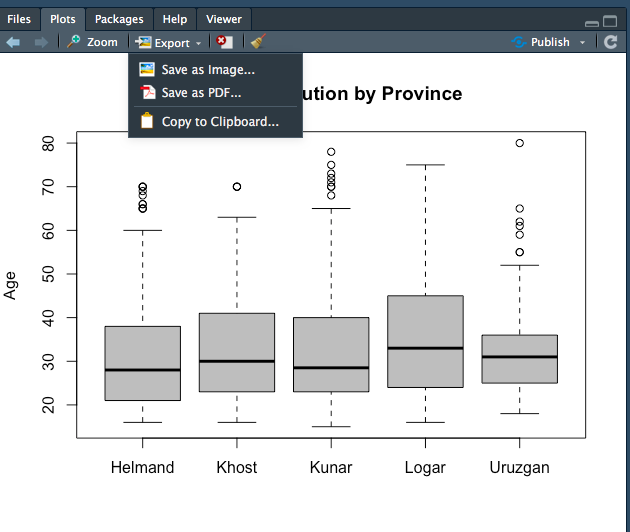
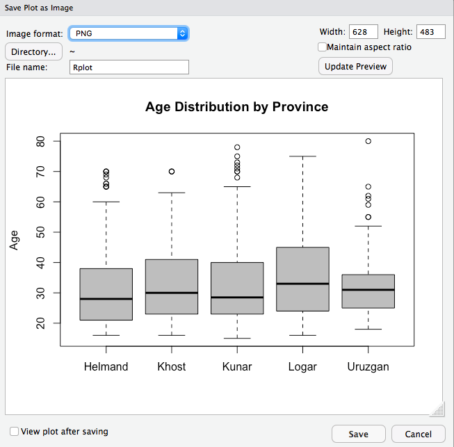
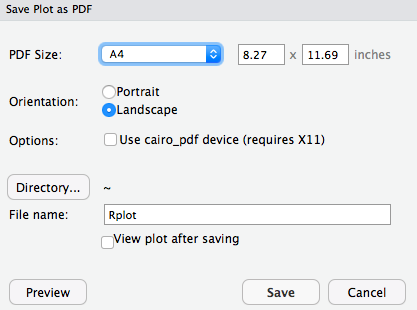
class: center, middle, inverse, title-slide # Week 04 - Measurement ## Box Plots and Survey Sampling <html> <div style="float:left"> </div> <hr color='#EB811B' size=1px width=800px> </html> ### Danilo Freire ### 15th February 2019 --- <style> .remark-slide-number { position: inherit; } .remark-slide-number .progress-bar-container { position: absolute; bottom: 0; height: 6px; display: block; left: 0; right: 0; } .remark-slide-number .progress-bar { height: 100%; background-color: #EB811B; } .orange { color: #EB811B; } </style> # Today's Agenda .font150[ * Visualising data: `boxplot()` * How to save R plots * Survey sampling methods ] --- # Box Plots .font150[ * Like histograms, box plots also display the distribution of a numeric variable * Box plots show _the median_, _quartiles_, and _IQR_ * Useful to compare different distributions side-by-side * It is also useful to identify outliers, that is, data points that are above 1.5 times the interquartile range (IQR) * `boxplot()` ] --- # Box Plots .font150[ * `boxplot()` also has a series of optional arguments: - `main`, `ylab`, `ylim`, `col` - `formula = y ~ group`, y is numeric variable and group is a factor ] --- # Box Plots ```r afghan <- read.csv("https://raw.githubusercontent.com/pols1600/pols1600.github.io/master/datasets/measurement/afghan.csv") names(afghan) ``` ``` ## [1] "province" "district" "village.id" ## [4] "age" "educ.years" "employed" ## [7] "income" "violent.exp.ISAF" "violent.exp.taliban" ## [10] "list.group" "list.response" ``` ```r median(afghan$age) ``` ``` ## [1] 30 ``` ```r quantile(afghan$age, probs = c(0, .25, .5, .75, 1)) ``` ``` ## 0% 25% 50% 75% 100% ## 15 22 30 40 80 ``` --- # Box Plots ```r boxplot(afghan$age, main = "Distribution of age", ylab = "Age", ylim = c(10, 80)) ``` <img src="week04c_files/figure-html/unnamed-chunk-2-1.png" style="display: block; margin: auto;" /> --- # Box Plots and Histograms .font150[ * To visualise the distribution of a single variable, histograms might be more informative. Compare: ] ```r hist(afghan$age, main = "Histogram - Age", xlab = "Age", ylim = c(0, 0.04), freq = FALSE) ## add a text label at (x, y) = (35, 0.35) text(x = 35, y = 0.035, "median") ## add a vertical line representing median abline(v = median(afghan$age)) ``` --- # Histogram <img src="week04c_files/figure-html/unnamed-chunk-4-1.png" style="display: block; margin: auto;" /> --- # Box Plots ```r boxplot(afghan$age, main = "Age Distribution", ylab = "Age", ylim = c(10, 80)) ``` <img src="week04c_files/figure-html/unnamed-chunk-5-1.png" style="display: block; margin: auto;" /> --- # Box Plots .font150[ * But box plots provide an easy way to compare multiple observations at a time * Similar to `tapply()` ] ```r tapply(afghan$age, afghan$province, median, na.rm = TRUE) ``` ``` ## Helmand Khost Kunar Logar Uruzgan ## 28.0 30.0 28.5 33.0 31.0 ``` --- # Box Plots ```r boxplot(afghan$age ~ afghan$province, main = "Age Distribution by Province", ylab = "Age", col = "grey") ``` <img src="week04c_files/figure-html/unnamed-chunk-7-1.png" style="display: block; margin: auto;" /> --- # Save R Plots .center[] --- # Save R Plots .center[] --- # Save R Plots .center[] --- class: inverse, center, middle # Questions? <html><div style='float:left'></div><hr color='#EB811B' size=1px width=720px></html> --- # Survey Sampling .font130[Last primaries:] .pull-left[ #### Democratic candidates * Hillary Clinton 44% * Bernie Sanders 26% * Joe Biden 20% ] .pull-right[ #### Republican candidates * Donald Trump 26% * Ben Carson 15% * Carly Fiorina 10% * Jeb Bush 9% * Marco Rubio 9% * Ted Cruz 6% ] .font110[Source: Huffington Post, Pollster] .font130[ * Most polls only interview several hundred voters ] -- .font130[ * Goal: infer what 200 million voters are thinking ] --- # The 1936 Literary Digest Poll .font150[ * Mail questionnaire to 10 million people * Final sample size: over 2.3 million returned * Addresses came from phone books and club memberships * The young Gallup used 50,000 respondents ] .center[ | | FDR's vote share | |:----------------|-----------------:| | Literary Digest | 43 | | George Gallup | 56 | | Actual Outcome | 62 | ] --- # The 1936 Literary Digest Poll .font150[ * Why did the Literary Digest get the numbers so wrong? ] -- .font150[ * .orange[Biased sample] ] --- # Quota Sampling vs Random Sampling .font150[ * **Quota sampling:** Sample certain groups until quota is filled * Problem: Unobservables can bias the results ] -- .font150[ * **Random sampling:** Random draws without replacement from the population * Everybody has the same chance of being in the sample * Problem: _none_, sample is unbiased! ] --- # Random Sampling .font150[ * Not every single sample will match all characteristics of the population exactly * But as the number of samples gets larger (say 1000 samples of 1000 respondents), on average the samples would be representative * Polls are associated with _uncertainty_: plus or minus a number * But getting a random sample is _hard_ ] --- # Difficulties .font130[ * Problems of telephone survey - Random digit dialing from phone book - Wealthy individuals have higher changes of being called - Caller ID screening (unit non-response) * Problems of internet survey - Non-probability sampling - Cheap but non-representative - Young, urban, rich groups are overrepresented - Requires statistical corrections (usually weights) ] --- class: inverse, center, middle # Questions? <html><div style='float:left'></div><hr color='#EB811B' size=1px width=720px></html> --- # Homework .font150[ * Think of some topics you would like to know more about * If possible, find some papers you would like to replicate * `MEASUREMENT02` ] --- class: inverse, center, middle # Have a Great Weekend! <html><div style='float:left'></div><hr color='#EB811B' size=1px width=720px></html>